The Company commissioned the C-Hack app to automate fault classification across their fleet of
trains, streamlining maintenance processes.
This long-term project involved extensive collaboration with stakeholders and employees across
multiple departments, highlighting its strategic importance to the organization.
My role spanned these critical phases of the project:
-
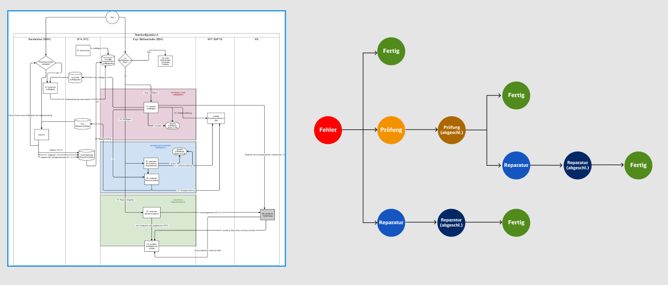
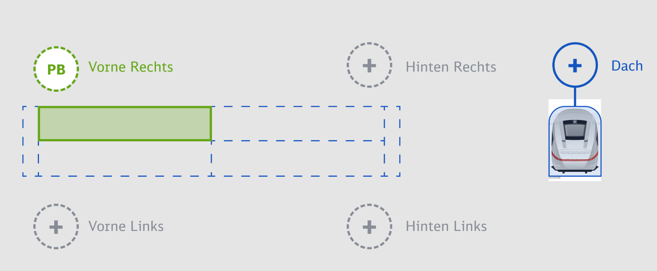
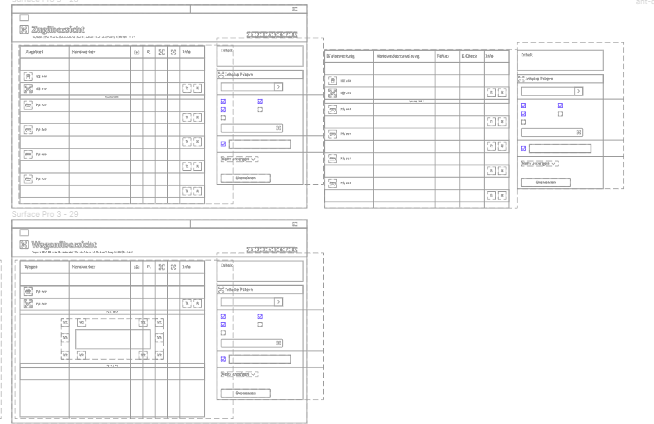
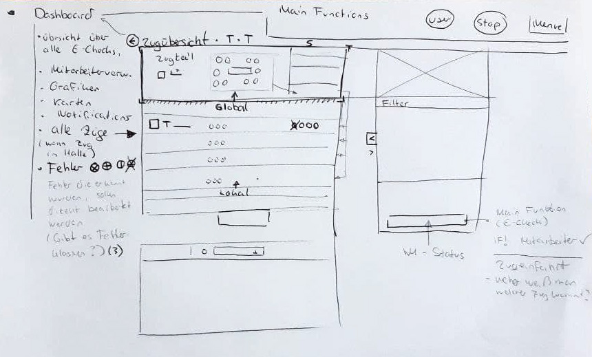
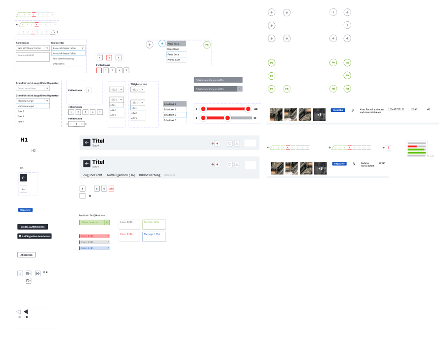
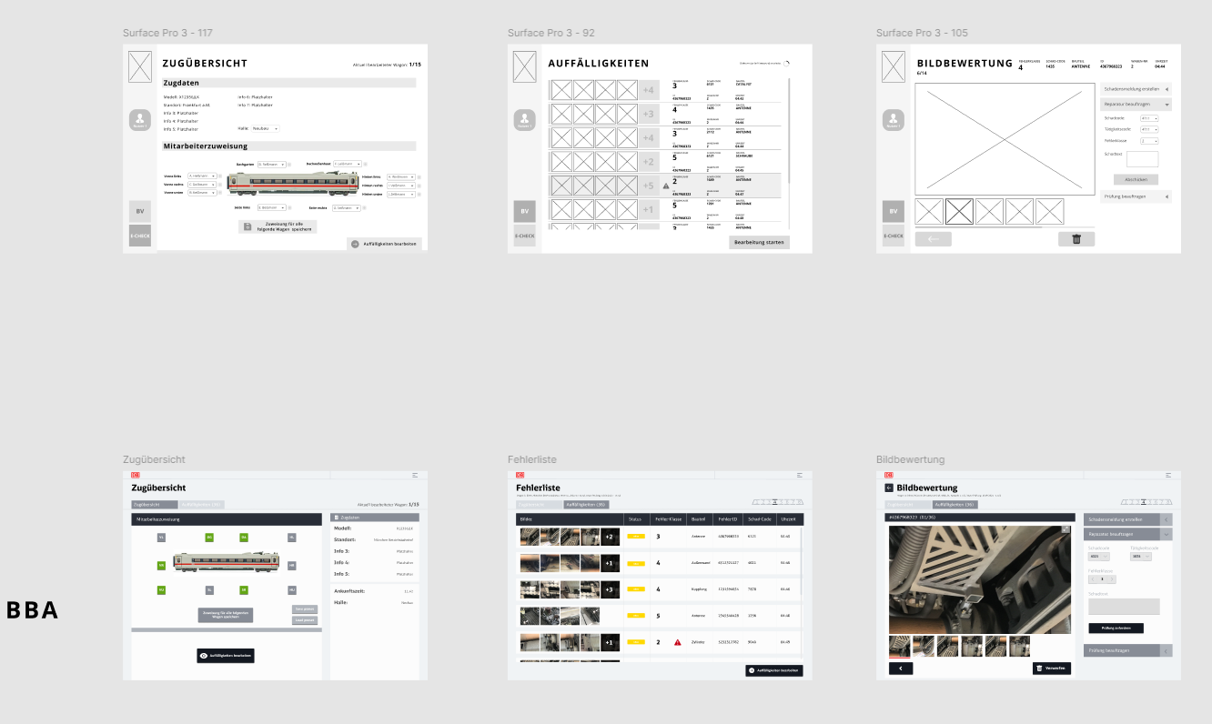
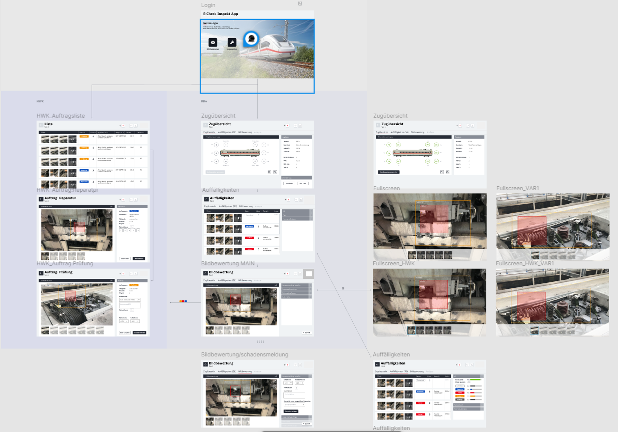
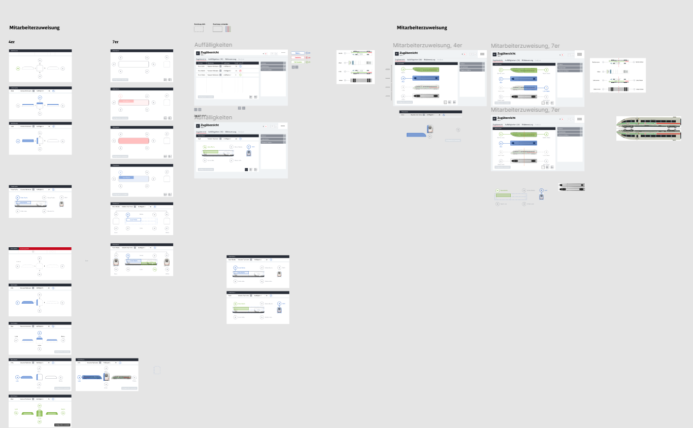
Wireframe construction: Translating a 2,000+ item requirements document into functional wireframes.
-
Prototype design:
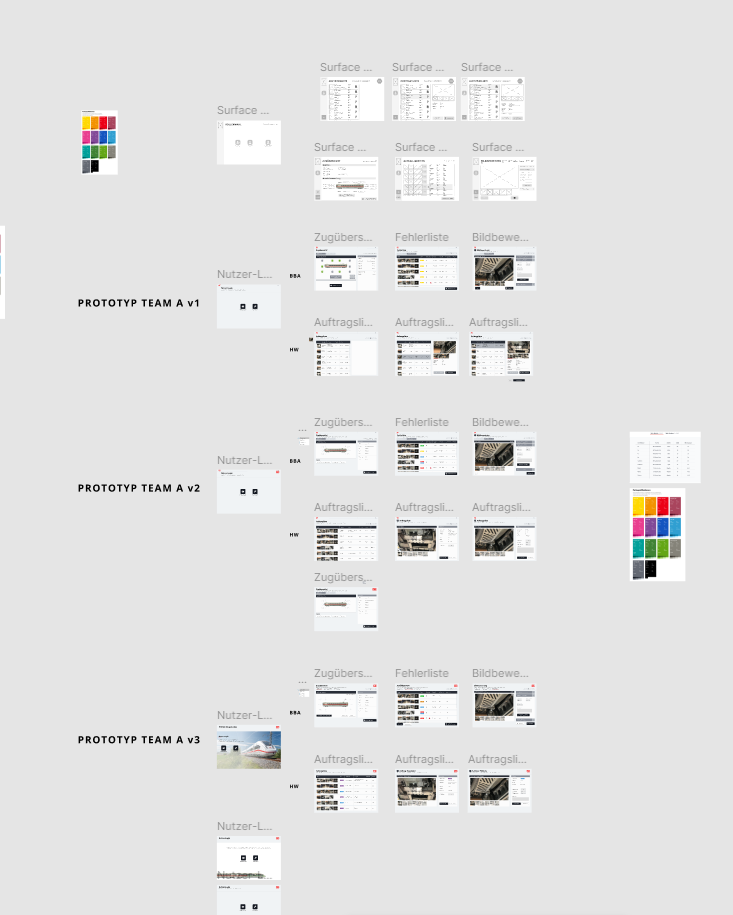
Creating an interactive click dummy that adhered to The Company’s corporate design and usability standards. -
Ensure compatibility across various devices and align with the company’s branding.
Problem Statement
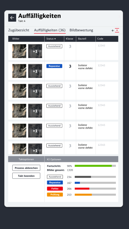
The Company faced challenges in managing and classifying train maintenance issues due to the complexity of their operations and the diverse roles of their staff. The company required a solution that would:
-
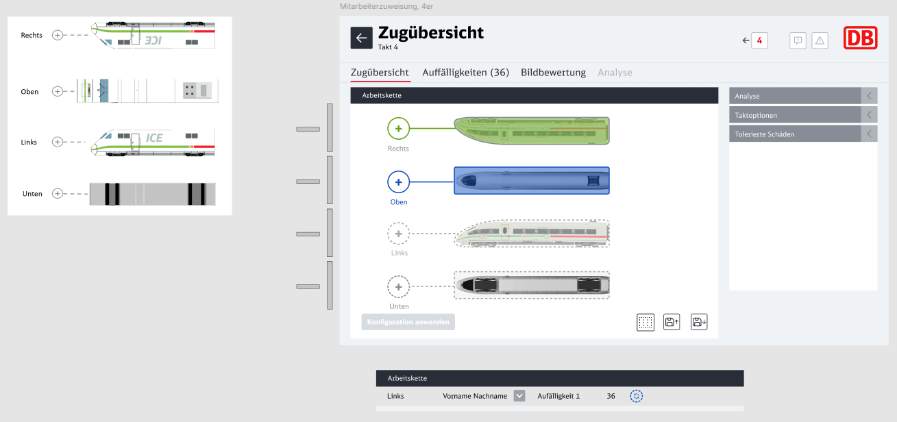
Enable seamless communication between users across different workshop locations.
-
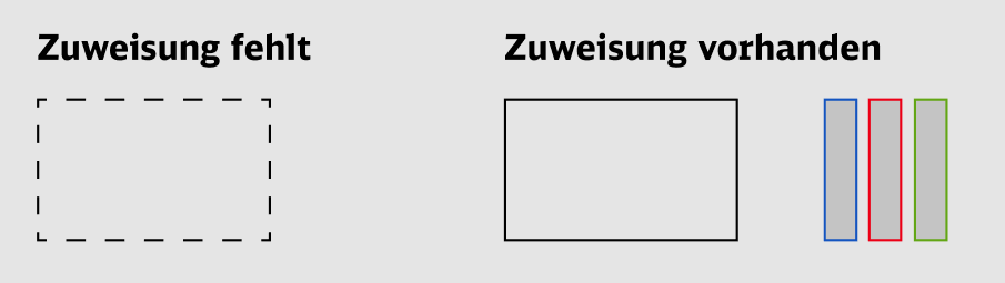
Simplify complex workflows while catering to diverse user roles.
-
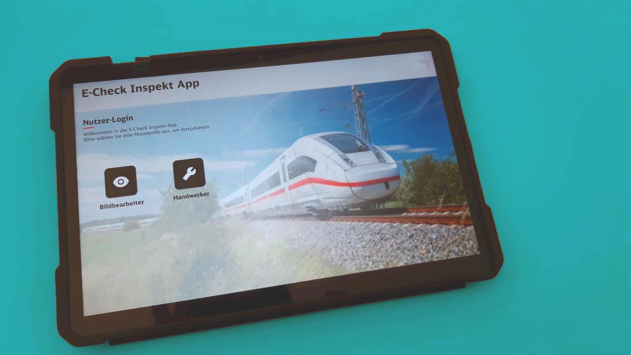
Ensure compatibility across various devices and align with the company’s branding.
Role and Responsibilities
-
Translating the extensive requirement list into actionable wireframes.
-
Collaborating with The Company’s internal project team to refine core functionalities.
-
Designing and developing an interactive prototype that adhered to The Company’s corporate design guidelines.
-
Participating in usability testing to gather feedback and iterate on the design.